![]()
![]()
![]()
![]()
Like all the best project Faber started with a clear identity. The Brief outlined from day one and so simple to build upon.
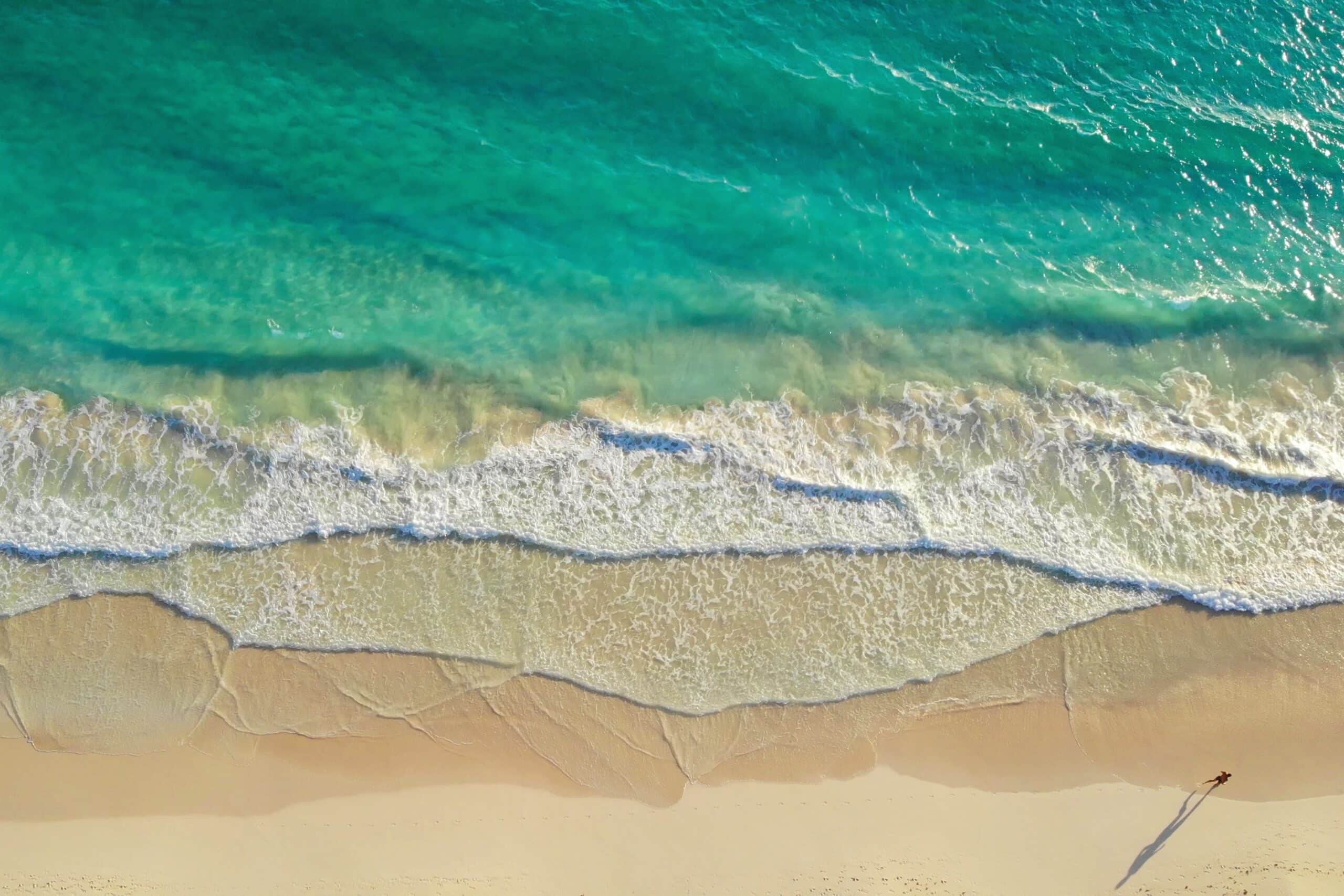
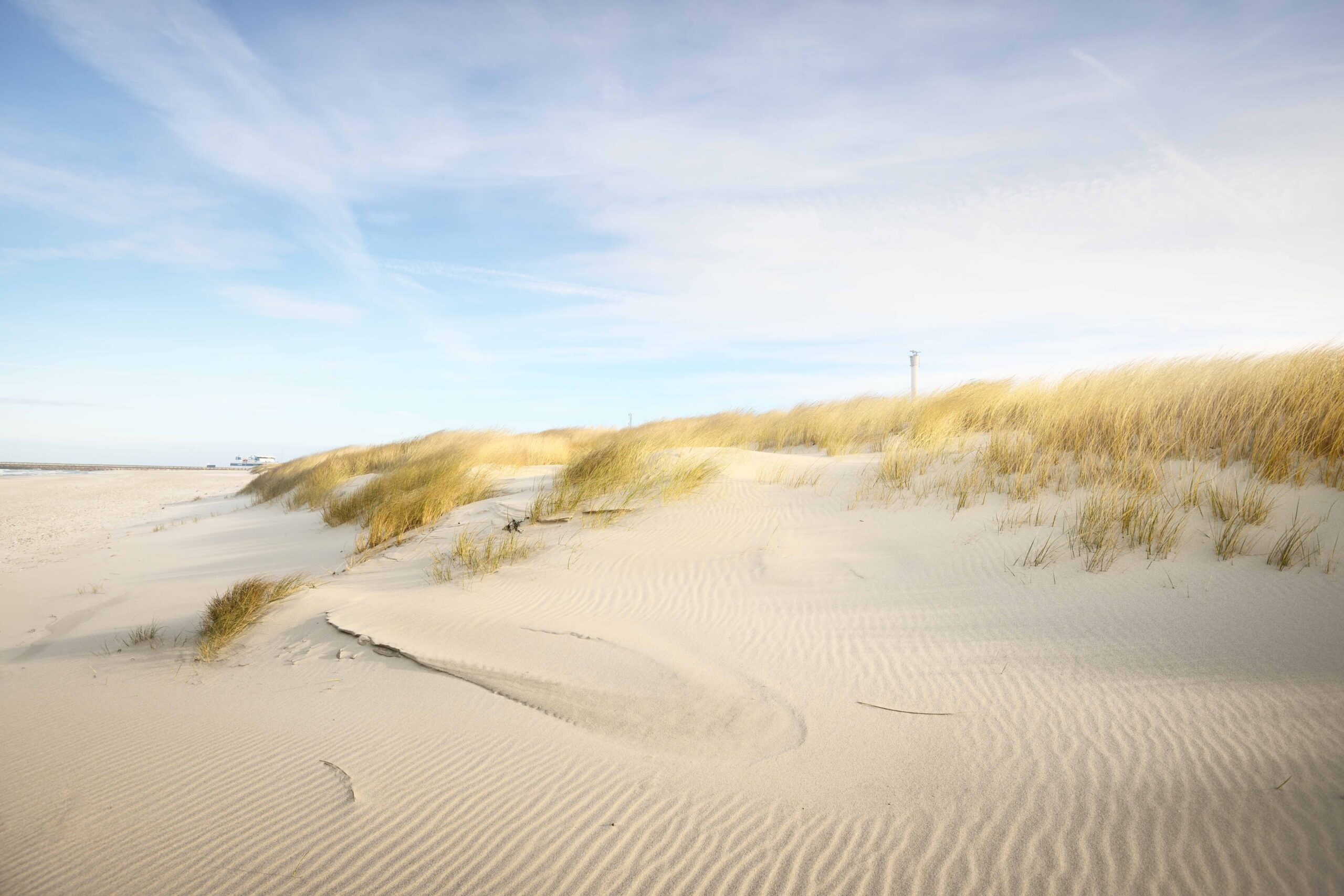
“A British seafood restaurant that draws inspiration from the British coastline.”
I wouldn’t say it was all simple and plain sailing (excuse the pun). In all my time as an interior designer I’ve never liked the idea of over ‘theming’ a venue or project, you always must play to the original features of the building and most definitely do not over work the space against what should be the venues strengths.
What was clear from the outset was that the team behind Faber were very much aligned to my opinion on theming. It’s easy to throw in some nets, lobster pots, buoys, hooks, and at worst plastic lobster or fish to create a nautical vibe! This was not what the team were after, they wanted to capture the subtle and dramatic beauty of the UK coastline in its many guises, this was a project I knew I would enjoy.
The best projects also have alignment across all parts of a creative team, this one felt right. The brand team at Natural Selection had taken Anthony & Matt’s already existing offer at The Victoria Mile End and elevated it to another level with a multi branding concept to suite all the layers of the venue from provenance, aesthetics, and ingredients. The brand very much matched the operational ethos of the business and guided the interior design on a level that gave direction but did not narrow what was possible. This was a project that could be subtle yet have really originality and impact.
Most people think a project begins with a mood board, but it doesn’t. the functional operation and feasibility come first. Creating the right space without breaking the bank on structural or engineering work comes first. It must be viable. The Faber team knew their offer, they knew the dishes, style of service, the format was set relatively easily.
The space had to be cosy, intimate and have a premium yet accessible undertone. I wanted the furniture to be soft and comfy for guest to feel comfortable enough to dwell in, too many restaurants adopt a hard Scandi or industrial vibe. The table needed to be large enough to encourage sharing plates, something the team were very clear on from the outset.
With a blueprint set and a clear vision (no lobster pots) a full story board could be composed. Colour and composition were very important, but I also wanted the space to be full of texture like you would experience when visiting the beach, think sand between your toes and the almost tangible minerally sea air. I believed this could be brought to life in a small space that would appeal to a wide audience.
“The overall feel is chic and quietly classy, while retaining an everyday, neighbourhood appeal.”
Natalie Waldron is a freelance interior designer based in the North East. With a large and varied portfolio including Gusto, Artezzan and Hermitage Rd. Natalie was head design for Living Ventures for 11 years before starting her own practise and has worked closely with the Faber team to develop a unique and authentic brand that showcases the best of the British Shoreline.
Fabrics: QUINTERO JADE, KATORI JADE, TOKI WILD ROSE, TOKI NIEBLA
Lights: BARTLETT PENDANT, CORRINE FROSTED GLASS WALL SCONCE, BRIDGERTON CHANDELIER
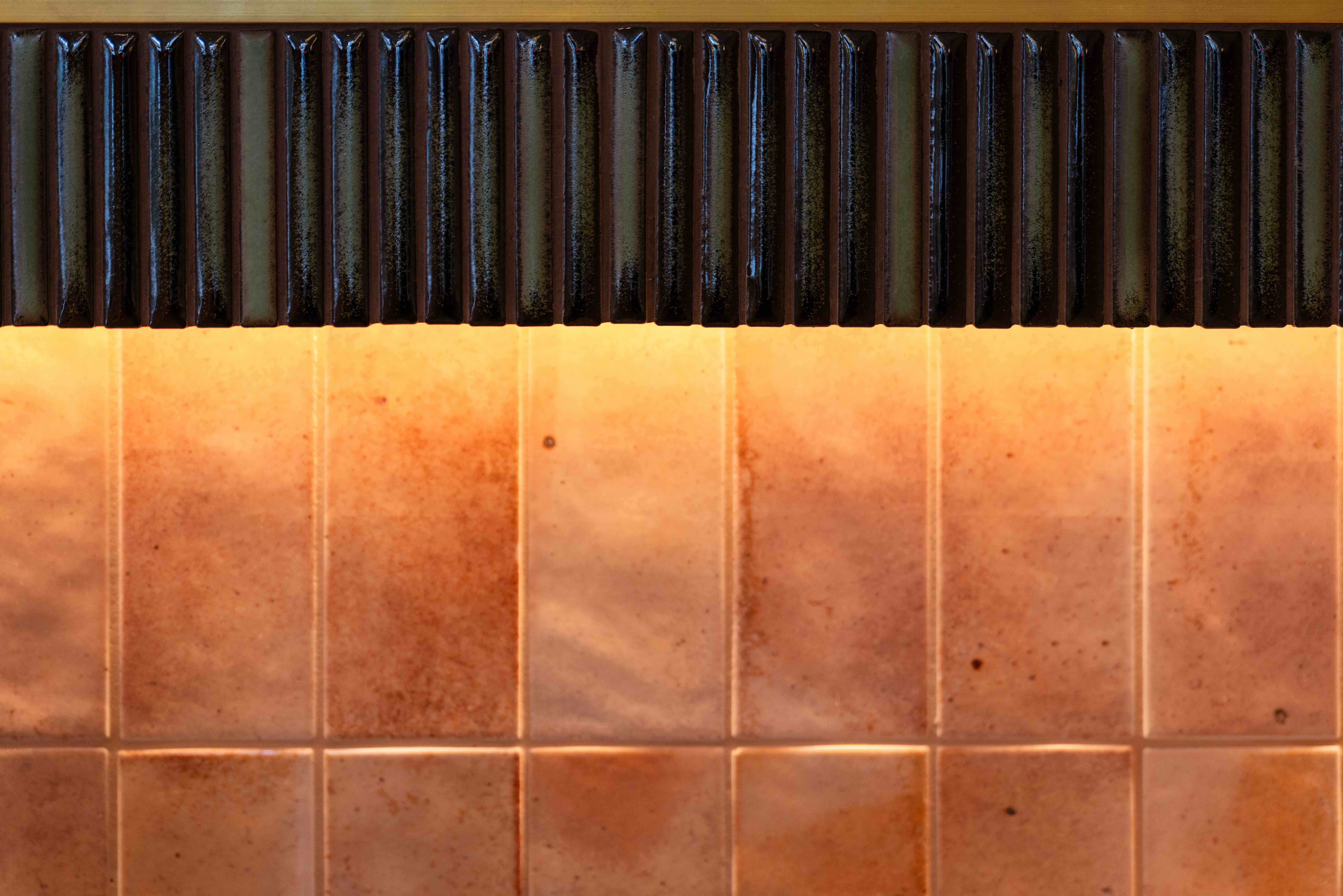
Tiles: EQUIPE HANOI PINK, BAMBOO LUSTRE PORCELAIN FOREST, ALISEO MARBLE SCALLOP, EQUIPE CELADON ACRO
Tables: FORMICA BRECCIA PARADISO . EDGE: BRUSHED BRASS EFFECT, TYPHA TABLE BASE
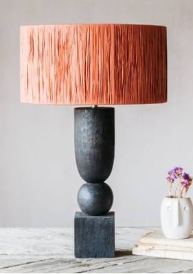
Table lamp: CLEMANCE SCULPTURAL TABLE LAMP
Wallpaper: MALACHITE
Wall paint: PRIMACOL SILVER SAND MALAGA S3
Earth Day offers a moment to reflect on the choices behind every plate at Faber. Rather than grand gestures, our approach is built on daily decisions — from refusing tuna, salmon and trawler-caught fish, to working exclusively with British day boat seafood. Alongside renewable energy kitchens, waste-to-energy systems and oysters that actively restore marine ecosystems, it is a considered, evolving way of cooking that looks to tread more lightly on the world around us.
Read moreRecent decisions by retailers to remove mackerel from sale have highlighted concerns around how the wider fishery is managed. Yet when caught by small coastal day boats using traditional hook-and-line methods, mackerel remains one of the most sustainable fish in British waters, which is why it continues to have a place on our menu.
Read moreFor centuries it was one of the great staples of the Thames and the estuaries of England. Londoners ate eel in pies, stews and jellied form, often bought from small street stalls that served the city’s dock workers, traders and labourers. It was local, abundant and deeply tied to the rivers that flowed through the country. Today eel carries a different reputation.
Read more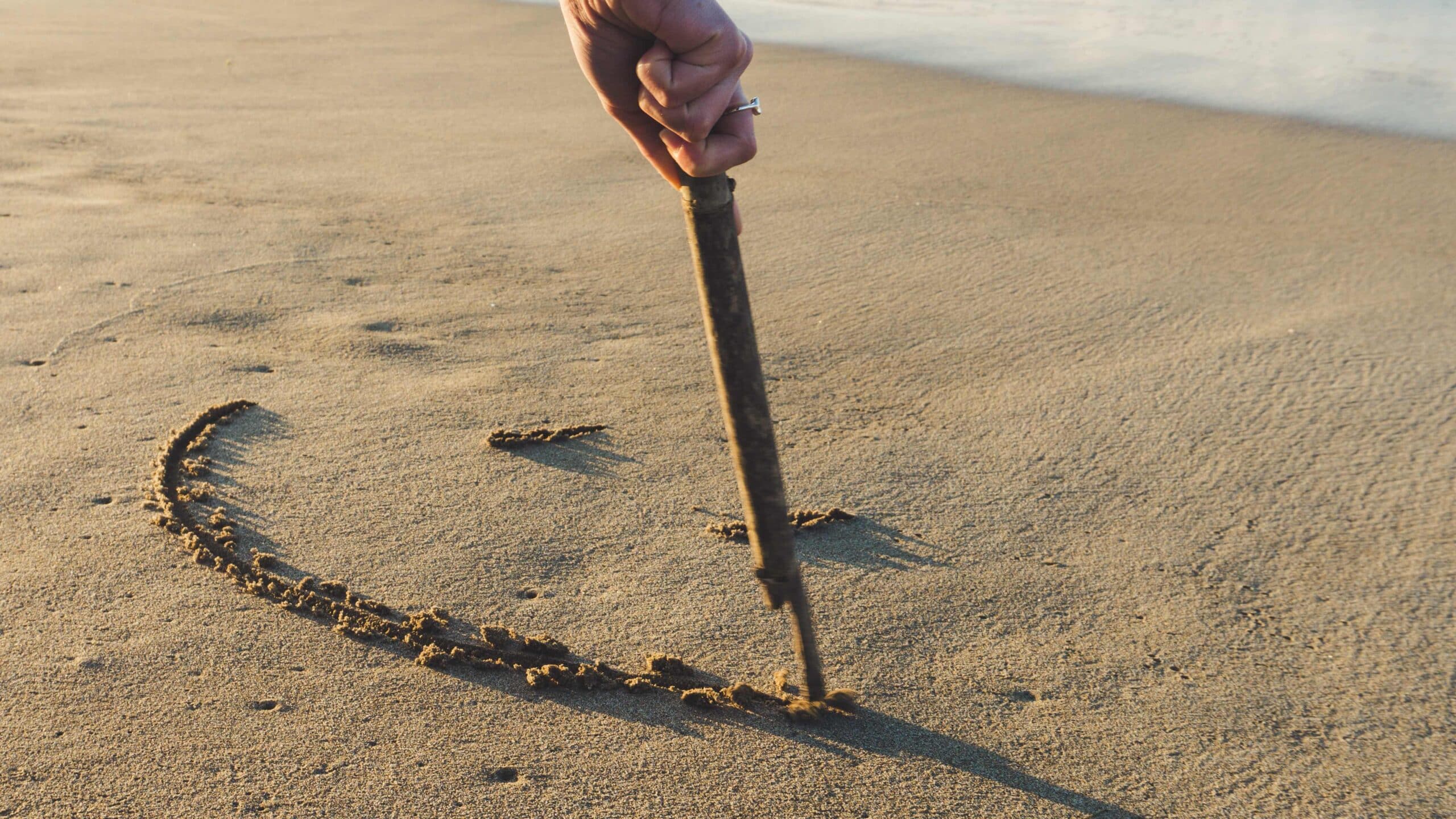